Reward page
Credit card holder's reward page case study
My Role
As a lead designer at Expedia group’s loyalty program
- Influence strategy for a project or product area by a coherent UX vision
- Build a toolkit of method for facilitating the gathering and synthesising insight.
Background
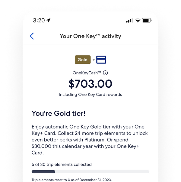
One Key
One Key is a newly introduced loyalty program by the Expedia group, which integrates the point systems of Expedia, Hotels.com, and VRBO into a unified platform. This allows users to conveniently earn and redeem points using a single account. The official launch of One Key is scheduled for July 2023.
Co-branded credit card
As part of the loyalty program, a co-branded credit card in collaboration with Wells Fargo will be introduced in July 2024. Cardholders will have the opportunity to earn additional points on their daily expenses. This unique product offering marks the first-ever travel co-branded credit card that allows users to accelerate their earnings on top of the rewards offered across all three travel booking platforms.
.png)
Job of the page
Reward page
Showcase the benefits of the OneKeyCard as a means to expedite OneKeyCash earnings on everyday purchases and bonus categories, encouraging travellers to make it their preferred choice of payment.
Do :
- Enable travellers to conveniently manage and make payments for their card through Wells Fargo.
Don't:
- Assume the role of a bank. Wells Fargo will handle transactional data management.
- Handle card-related functions such as cancellations or upgrades.
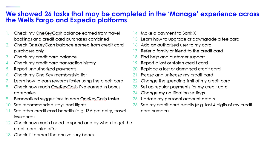
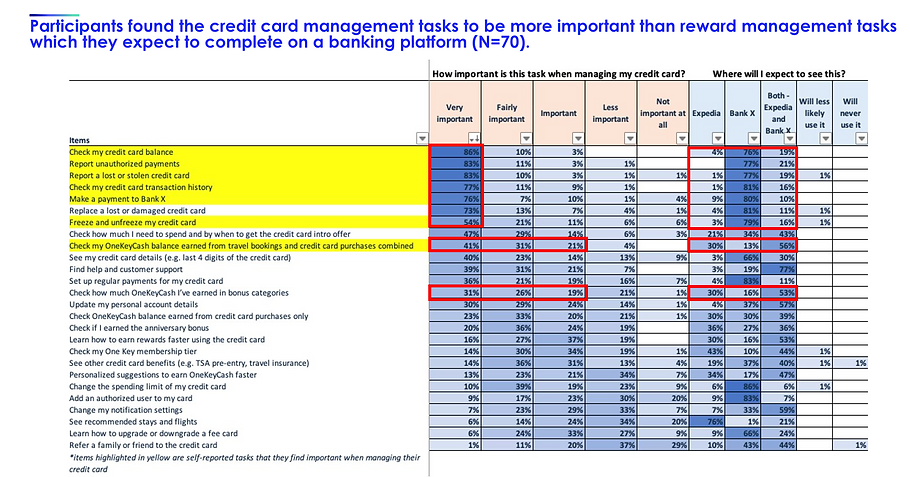
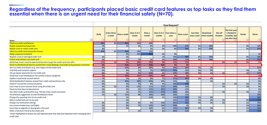
Top task analysis
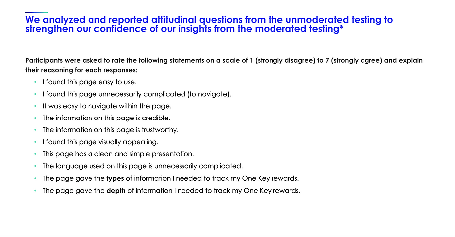
Objectives for this research is to :
-
Identify the 'Reward page' requirements for DAY1 from the perspective of travellers.
-
Gain insights into the primary tasks that travellers expect to perform on the rewards activity page.
-
Understand the frequency with which travellers anticipate engaging with these top tasks.
-
Determine whether travellers expect to complete the top tasks on Wells Fargo, Expedia, or both platforms.
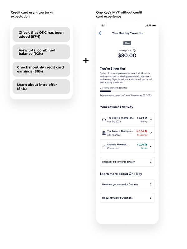
Features for Credit Card user
The new features were established by leveraging the top task analysis and assessing the technological readiness of our loyalty system.
.png)
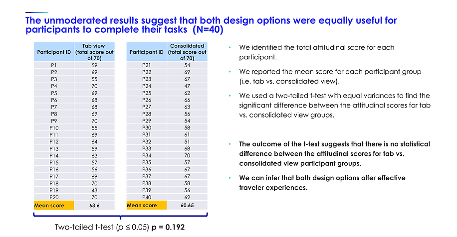
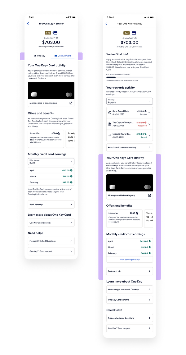
Tab view vs Consolidated view user test
The credit card content aligns with OneKey's reward page structure, as the OneKey launch preceded the credit card's launch by a year. The primary challenge lies in effectively communicating to users that the total available OneKey Cash represents the combined reward activity from both bookings and credit card spending. Achieving clear communication regarding this aspect is of utmost importance. This presented a layout and content hierarchy challenge.
Navigation user testing
We have considered various design options, including a 2-page layout, tabbed view, and consolidated view. Based on usability testing, we have decided to implement the consolidated design for DAY 1. Additionally, we conducted research to identify the most crucial information and tasks that users prioritise, which helped establish the content hierarchy.
The testing results indicated no significant issues related to usability or comprehension.

Test highlight